Capybara.AI MVP
Core Team
Jerry (PM), Me (Product & Visual Designer)
Period
2023 - 2024, 10 months, shipped
What's Capybara.ai?
Capybara.AI is a fintech startup based in the United States. Capybara.AI aims to help amateur stock enthusiasts and financial experts obtain the most comprehensive stock information in the shortest amount of time through the use of large language models.
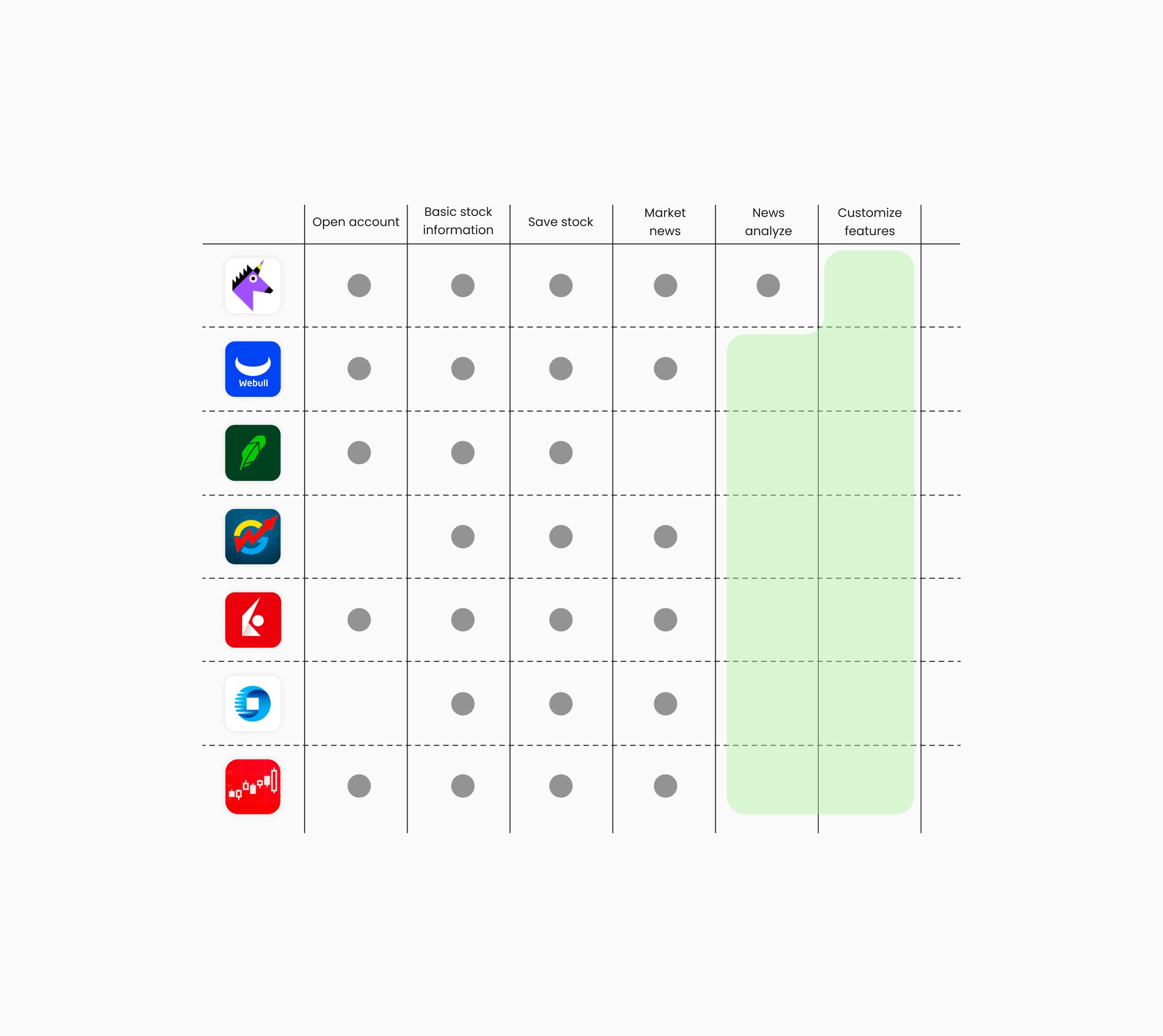
Market & User Research
Stock investment products on the market only push a large amount of information to users. They do not consider how users handle this complex information. Additionally, due to the lack of analysis and evaluation features tailored specifically for users, it is difficult for users to start investing with confidence and ease.
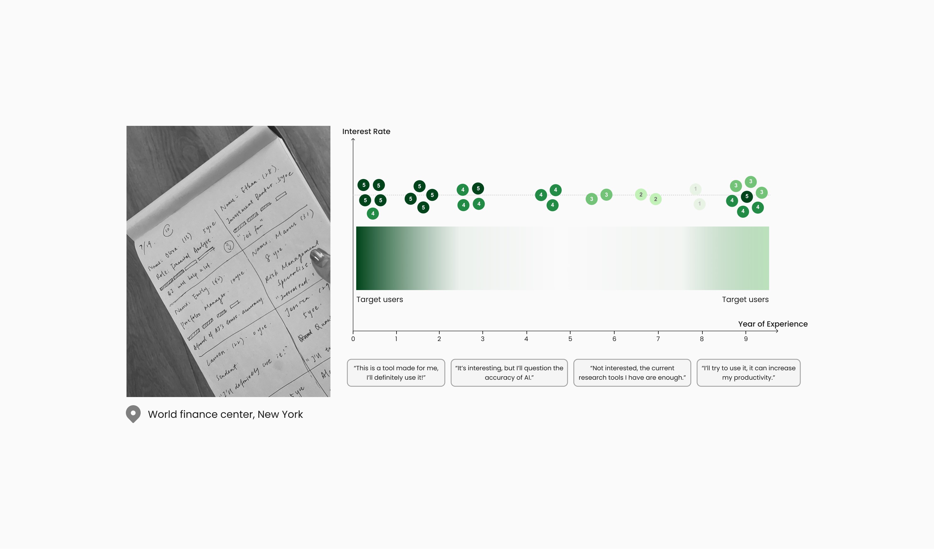
After randomly interviewing over 30 financial industry professionals with varying work experiences, we have gained a general understanding of our target users. We found that people with 0 to 3 years of experience and those with more than 9 years of experience are very interested in our product and have expressed a willingness to try it.
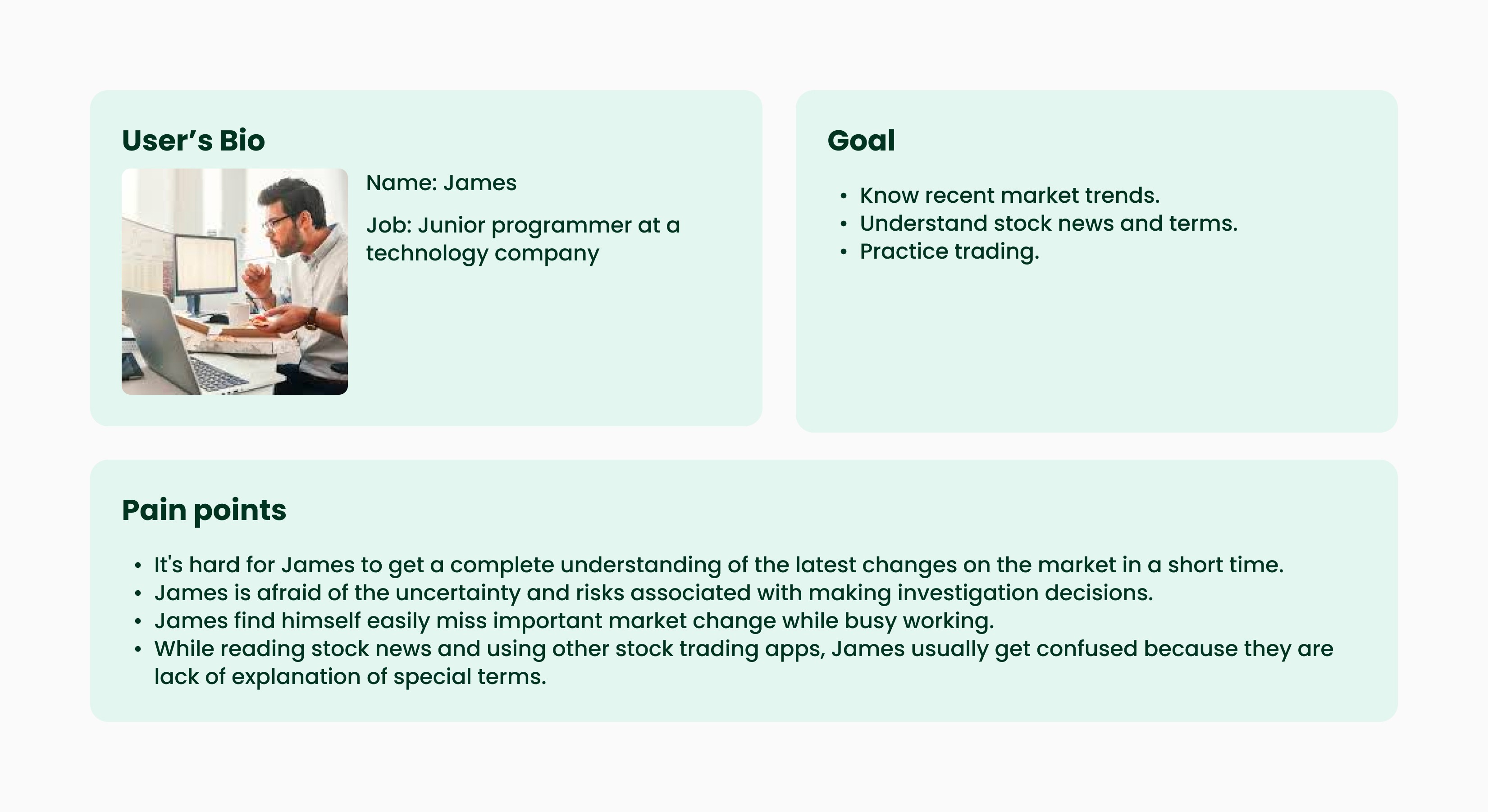
User's needs
After conducting 1:1 user interviews with 6 retail investors and 4 financial experts, I summarized 4 main user pain points through card sorting.

Product Focus
Goal
Feature
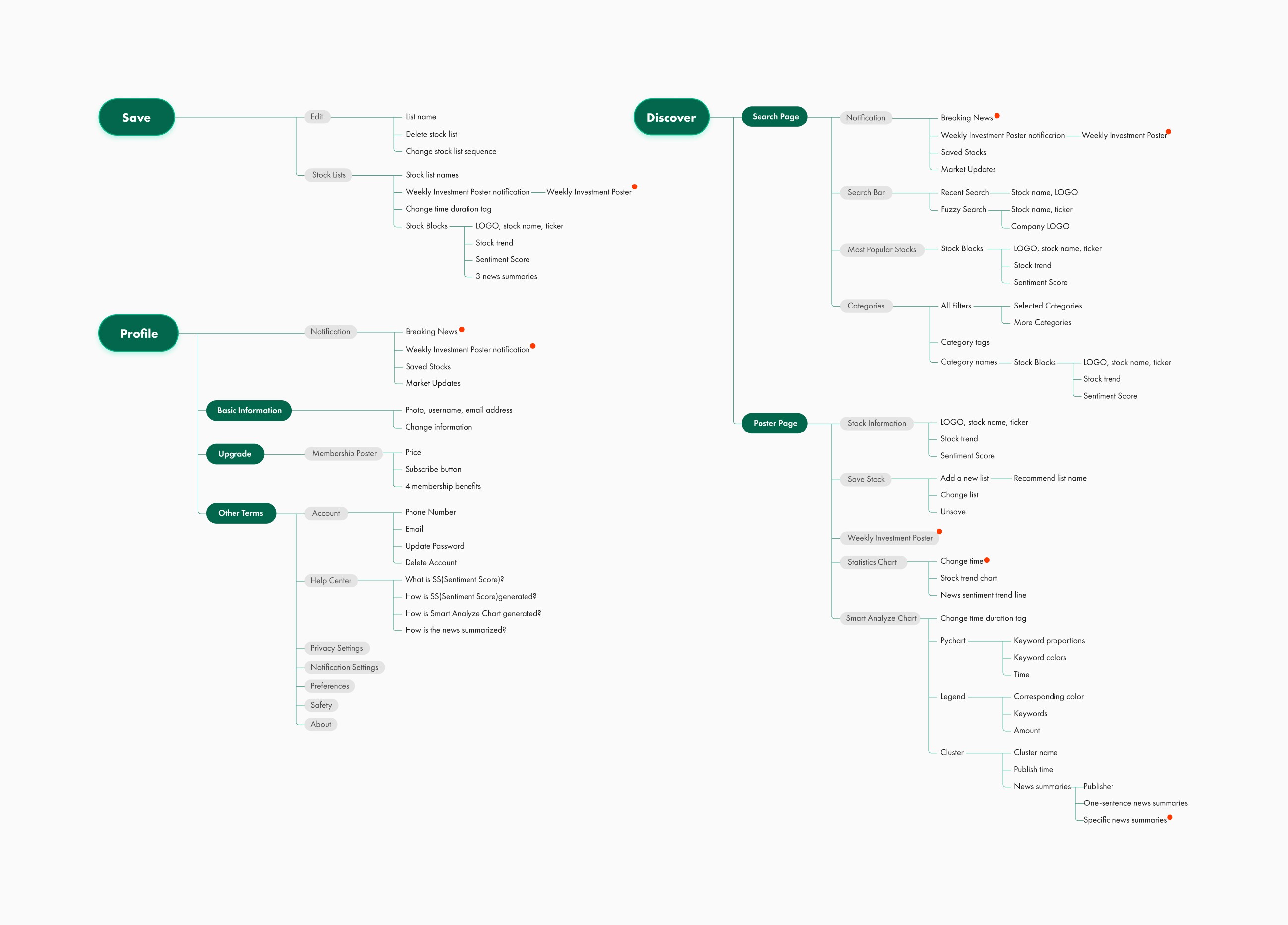
Information Architecture
I designed the information architecture for the whole application based on the key product features.
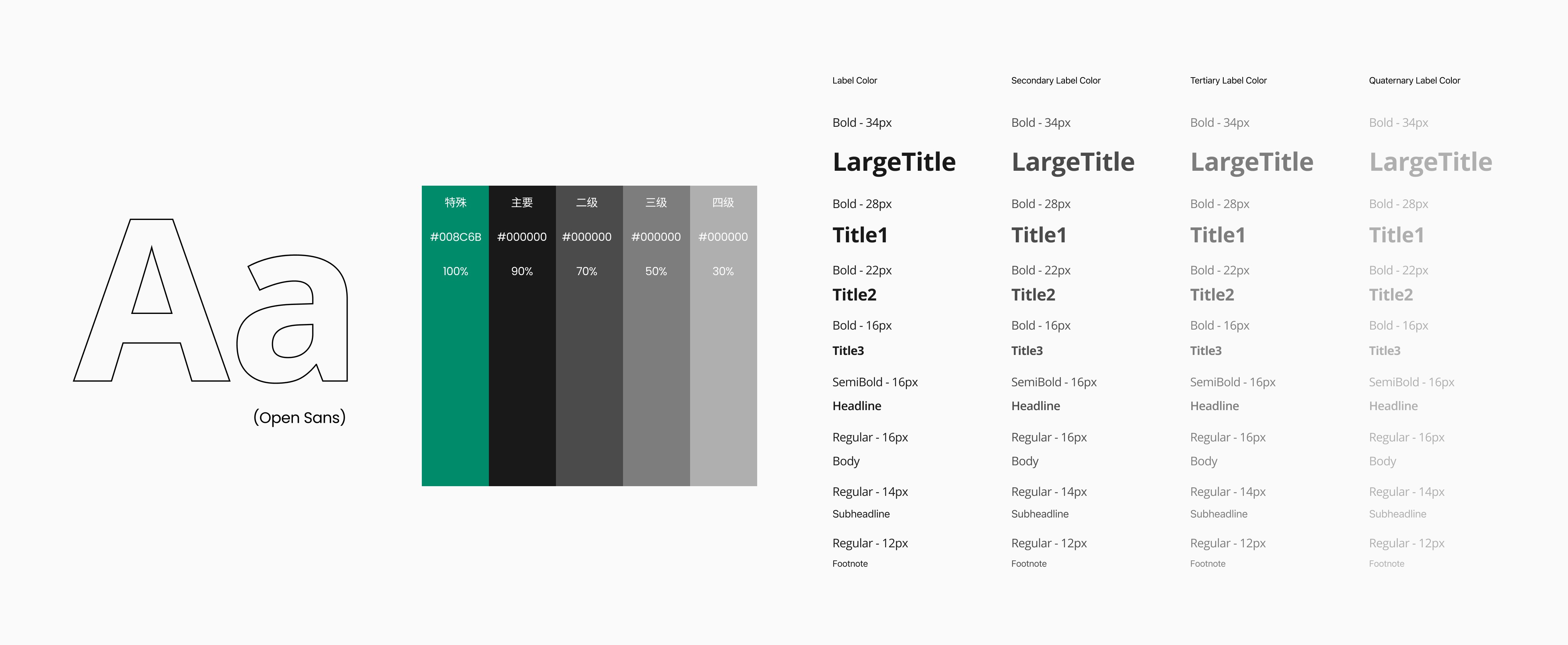
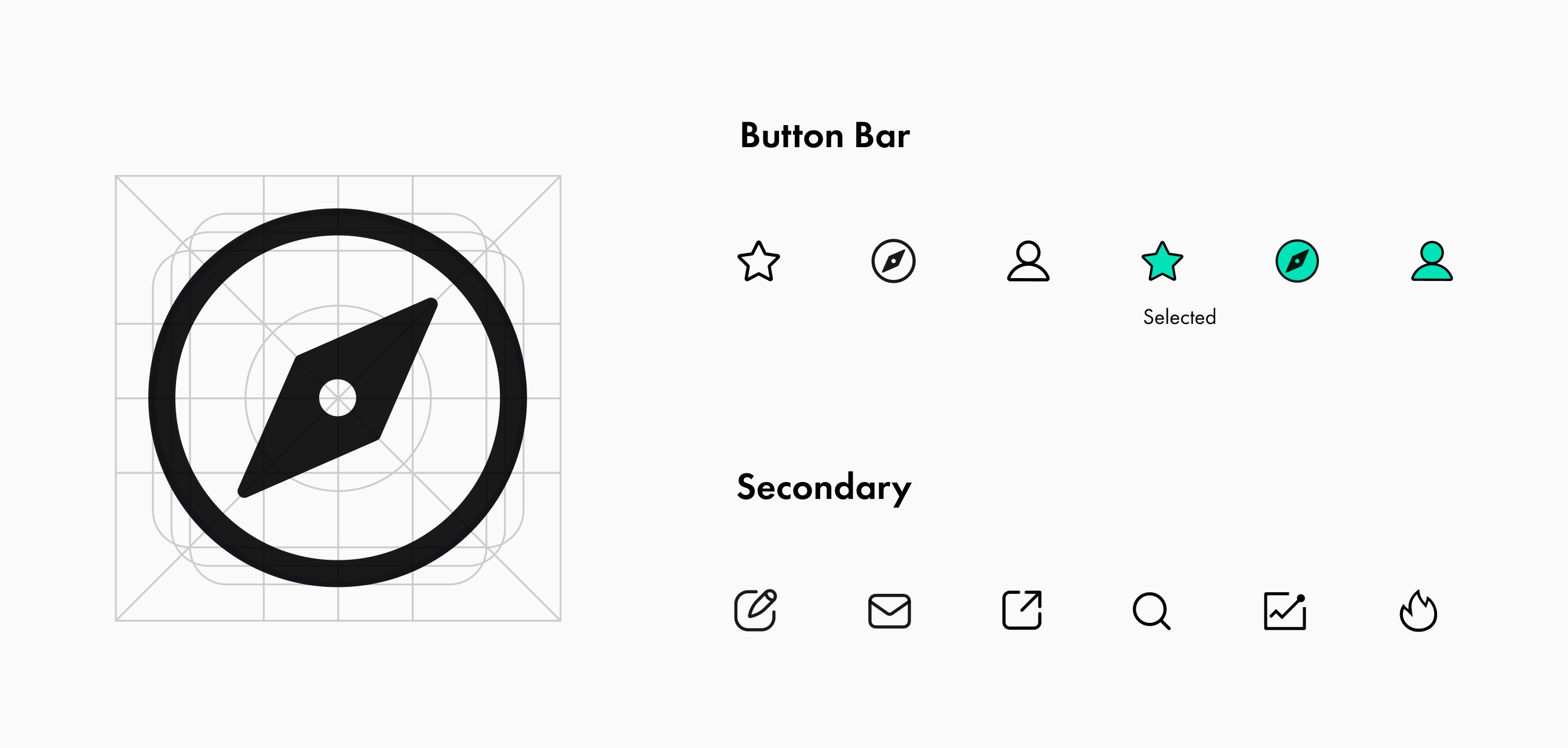
Visual Design Principles
To ensure visual consistency and clear information hierarchy, I established a complete set of typography guidelines. For accessibility reasons, no font size is smaller than 12px.
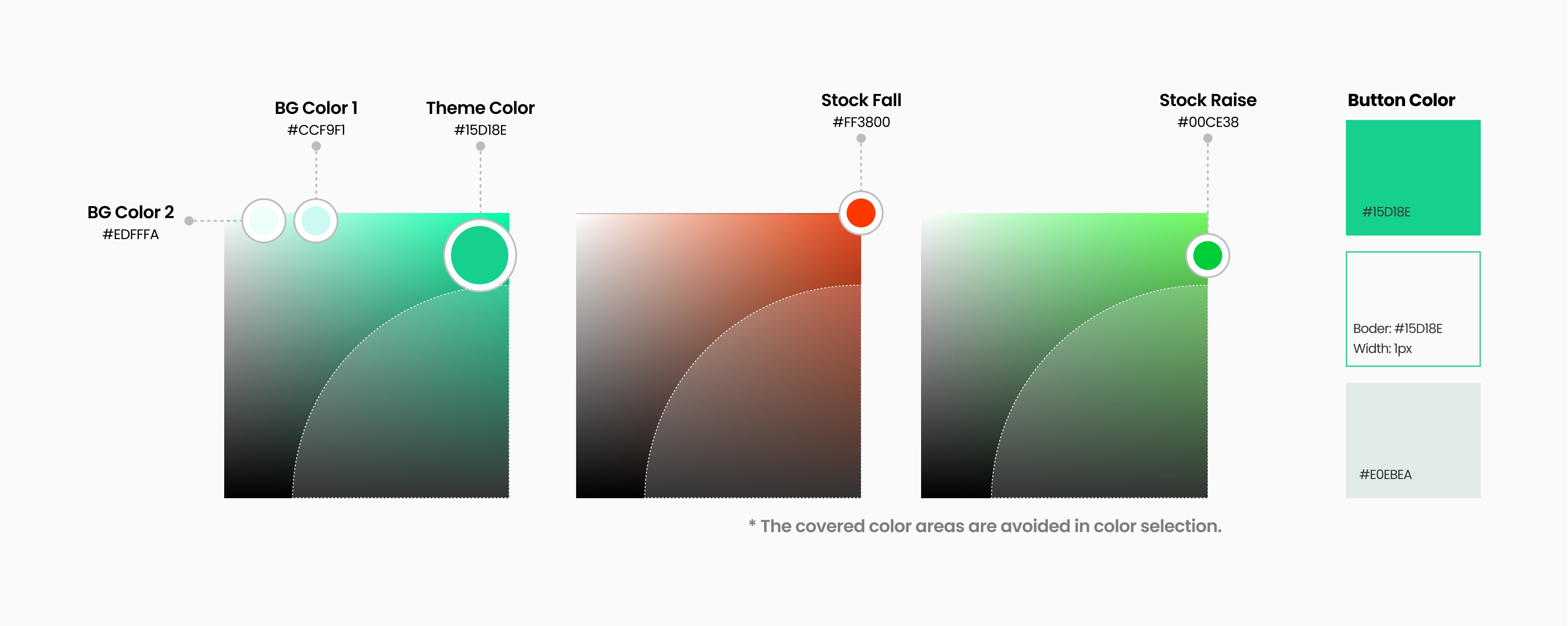
Color is a crucial element in expressing the product's brand. I chose mint green as the primary color because it conveys a bright, cheerful, and uplifting feeling. I avoided using dull colors to prevent any discordance in the interface.
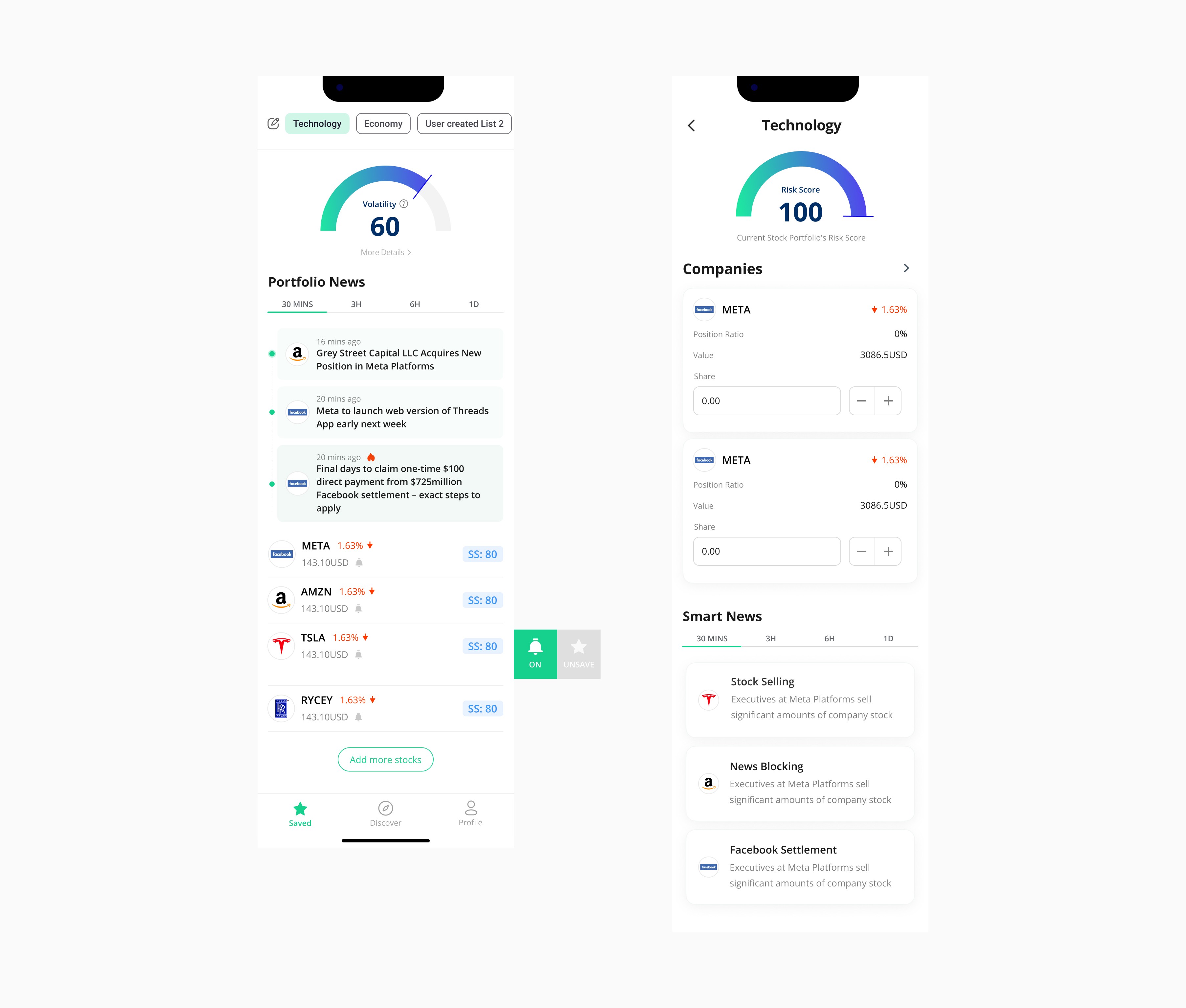
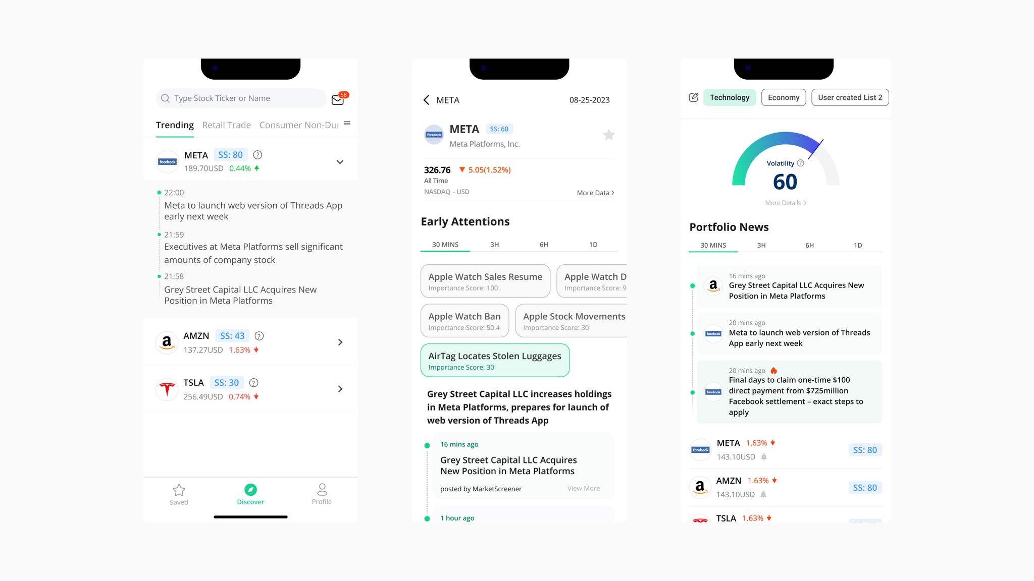
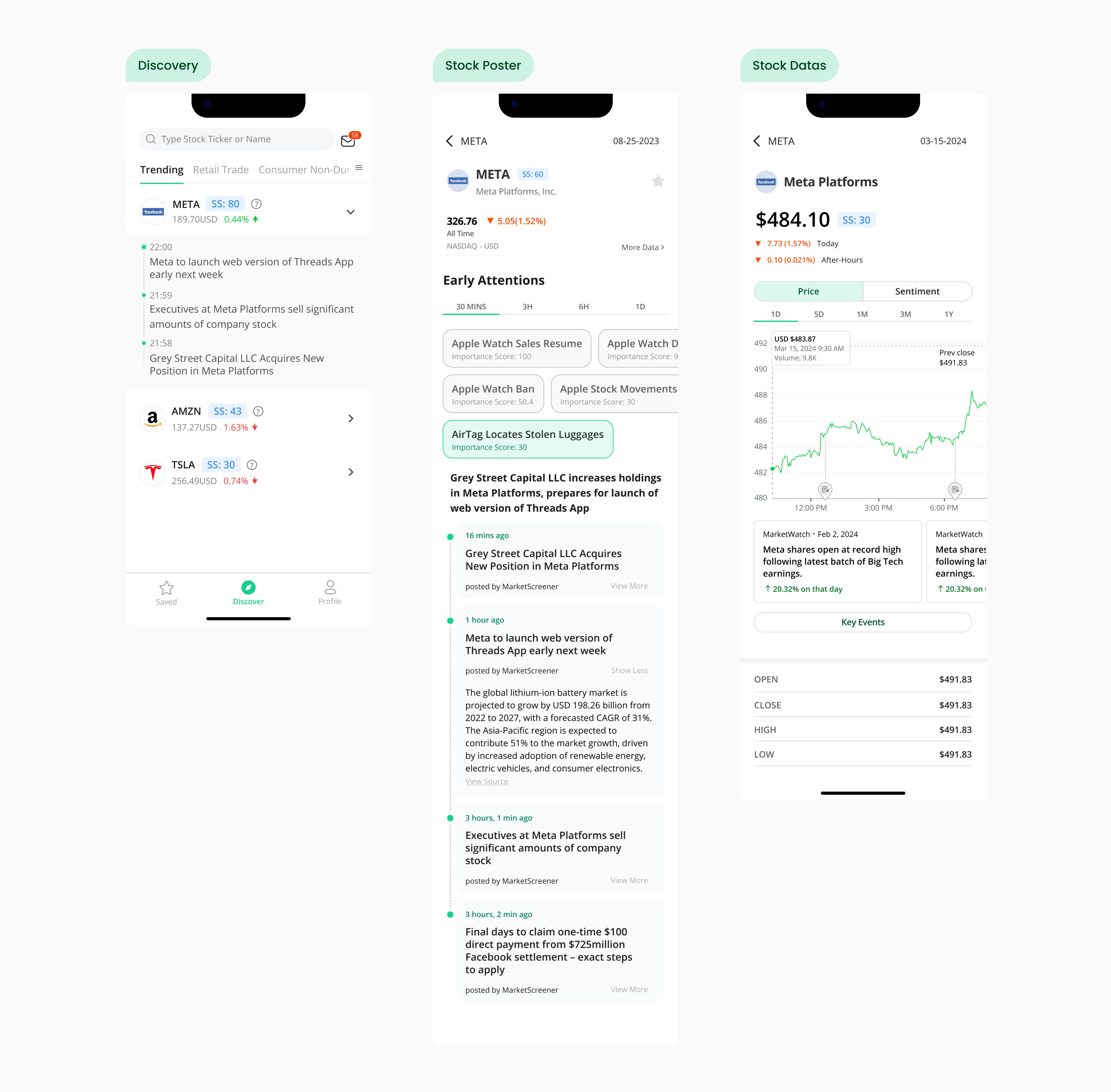
Stock Poster
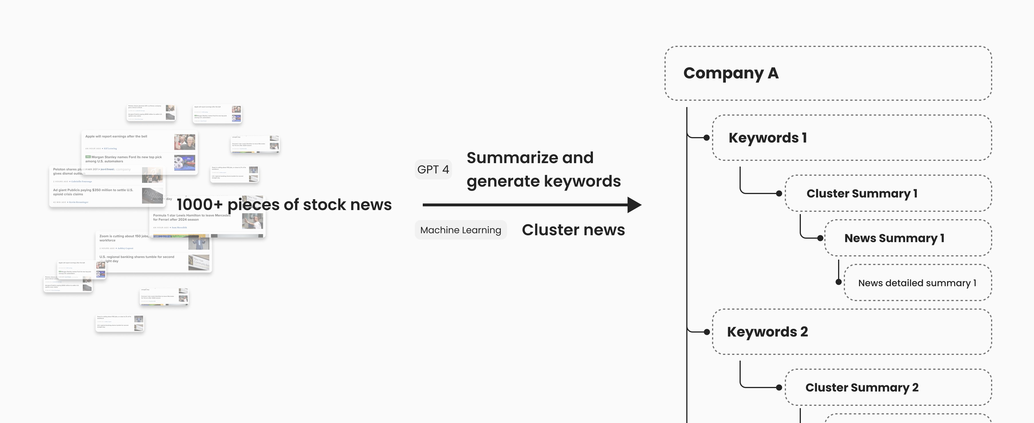
To address the issue of users spending a significant amount of time reading and filtering repetitive long news articles, I propose using a large language model to categorize news in the market by company, topic, and content. This approach aims to reduce the time and effort users spend reading, while ensuring they can easily find the information they are looking for.
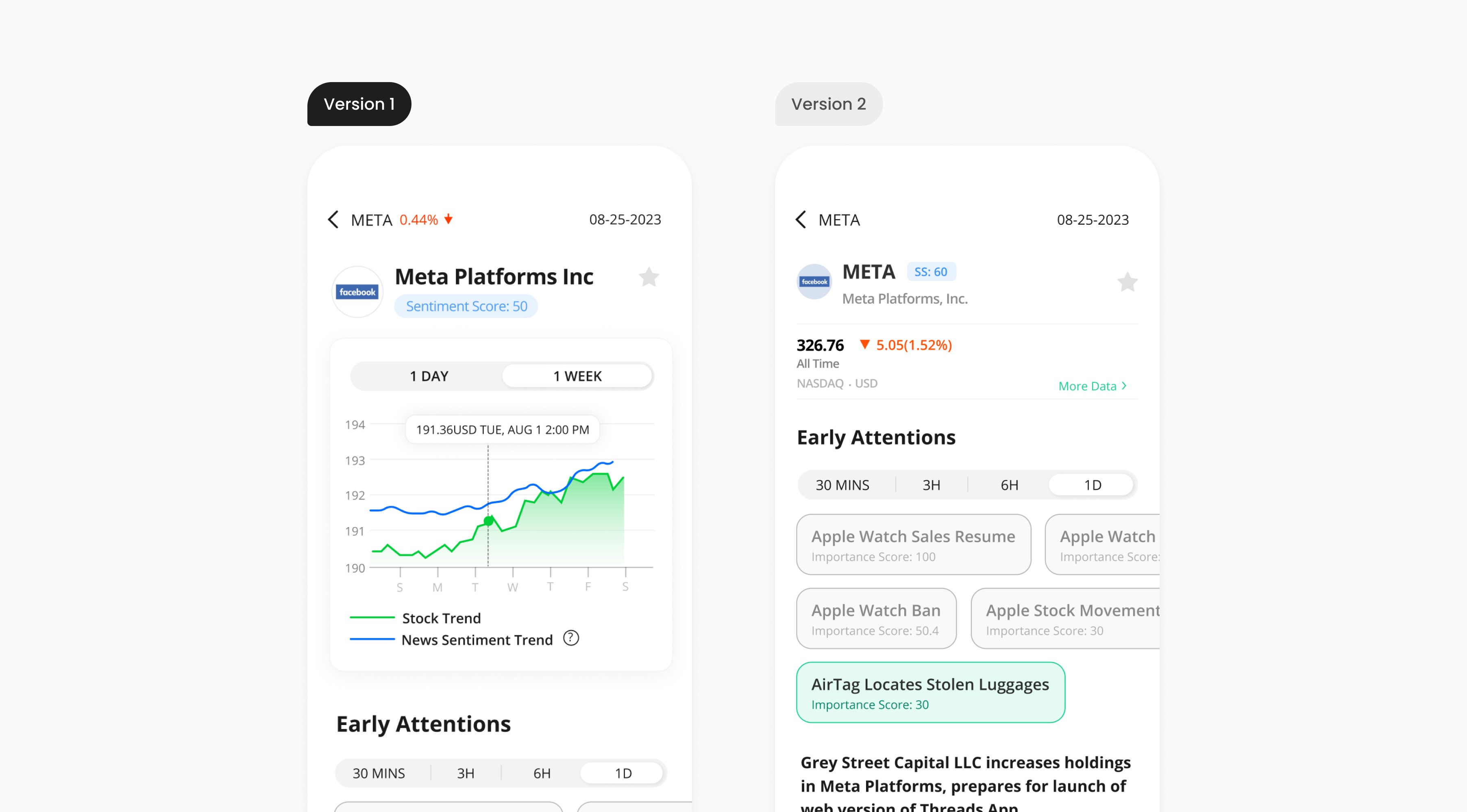
When designing the information layout for the stock poster interface, I explored different approaches.
I decided to use the second version because it has enough space to present stock information completely and clearly. Users can easily filter out the news they are interested in by clicking the keywords. Besides, it better highlights the information that is important to users.
Paper Trading