ParkourSC
Rebranding for agility and innovation.
Industry
Supply Chain & Technology
Agency
Tangosquared
My Role
Lead Designer
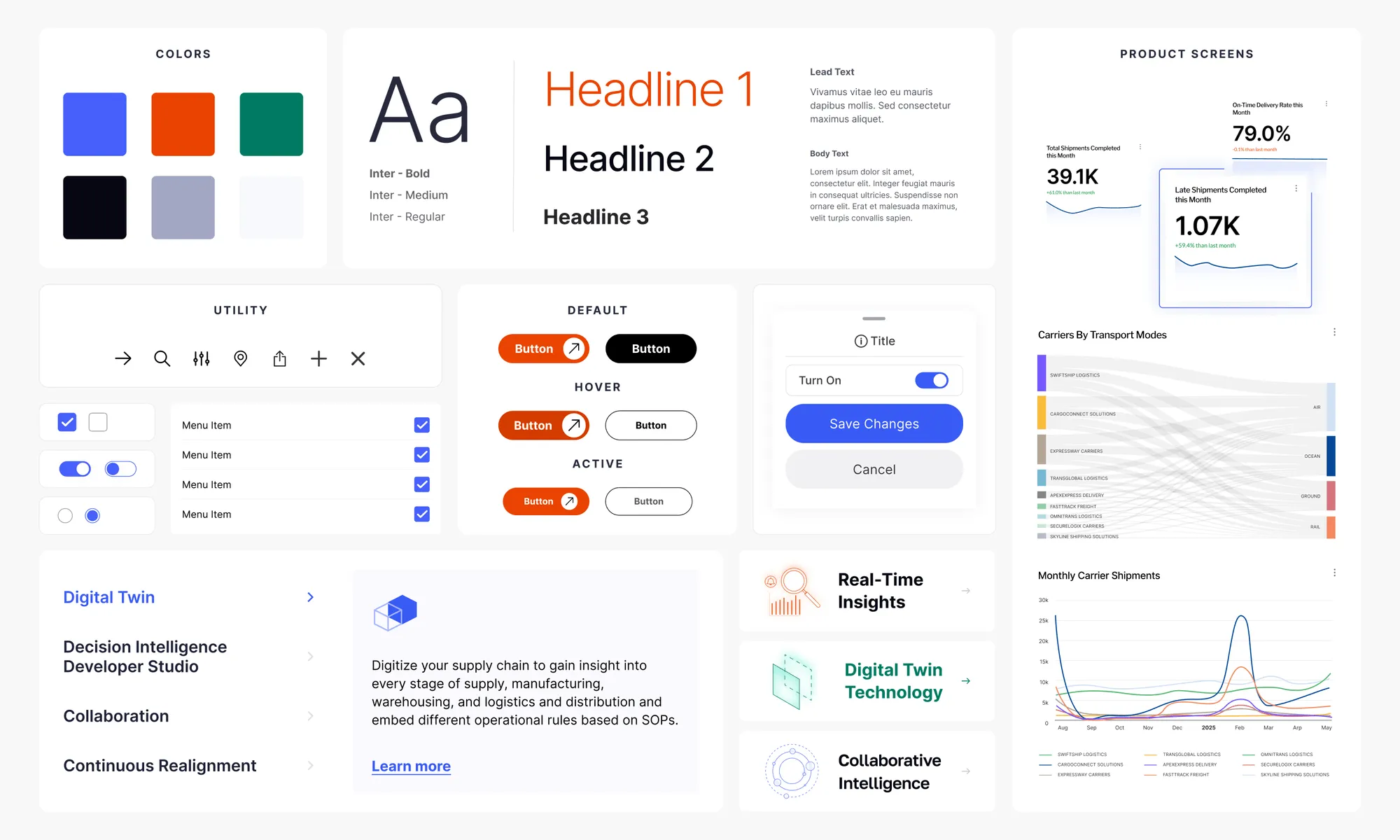
Deliverables
- Brand Strategy
- Website
- Marketing Collateral
- Live site
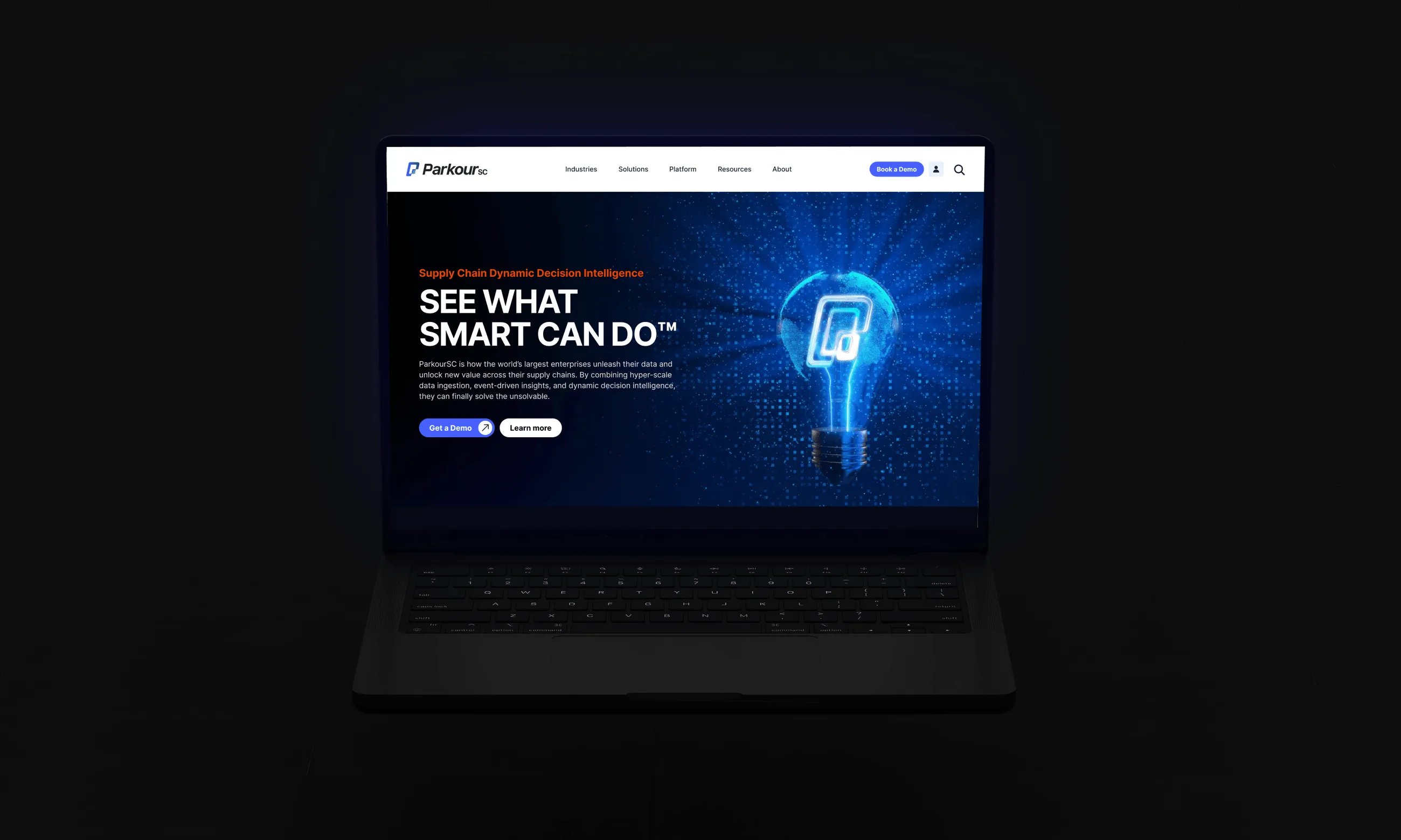
Rebranding for agility and innovation.
ParkourSC, formerly Cloudleaf, has spent years helping businesses transform their supply chain operations through real-time visibility and predictive insights.
As ParkourSC grew, it became clear that the brand needed to evolve along with the technology. The challenge wasn’t just updating the logo—it was capturing the core of what ParkourSC does: creating simplicity and focus in an otherwise complex landscape.


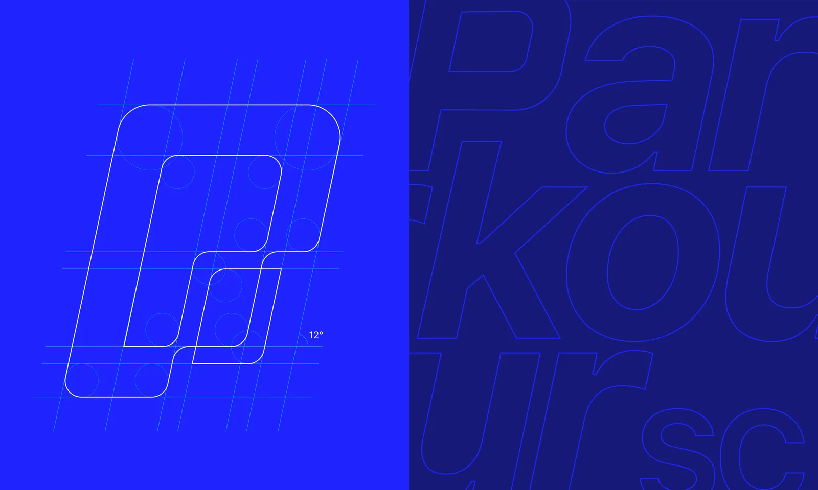
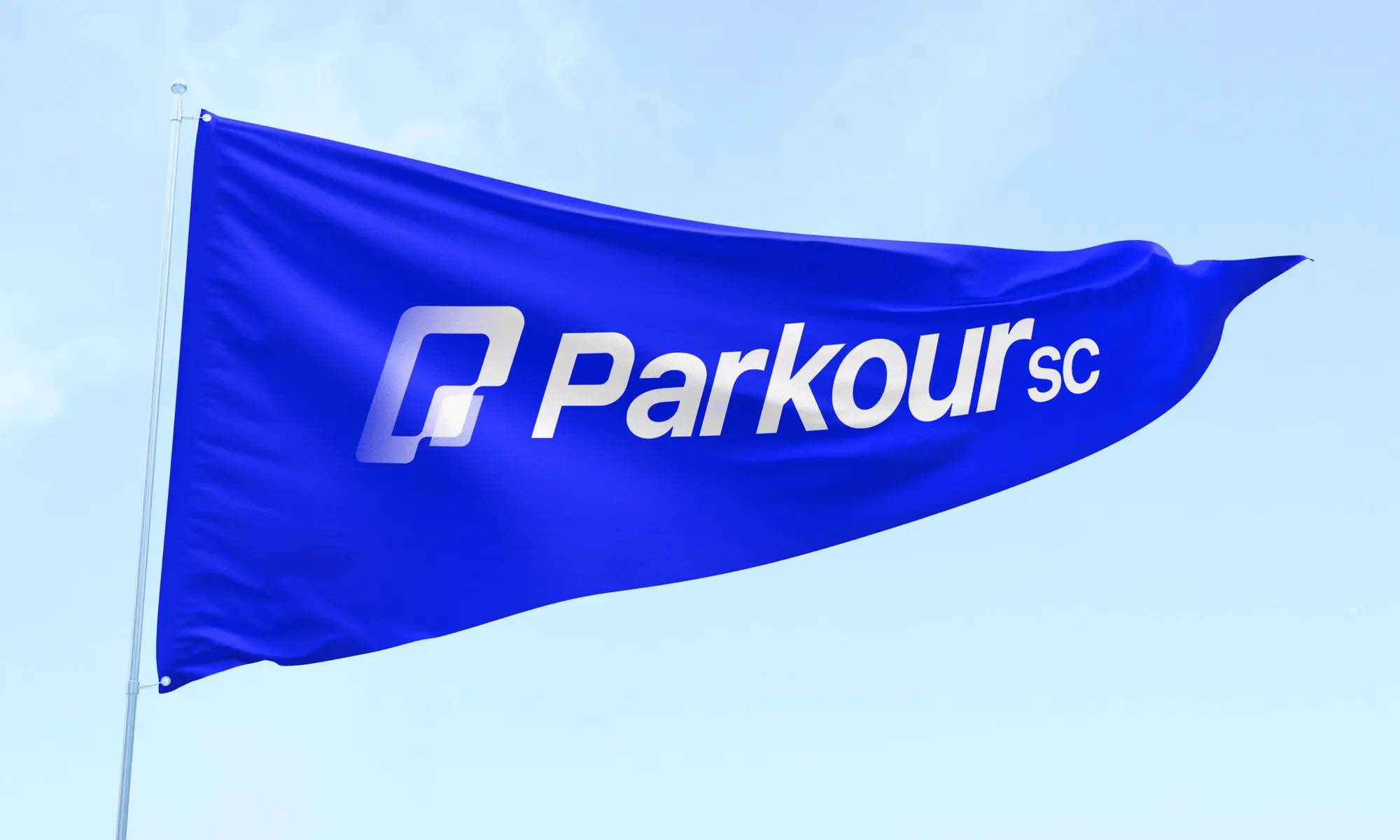
We drew inspiration from parkour’s fluidity and agility to design a logo that reflects movement and adaptability, with a nod to the digital twin concept at the platform’s core. A bold blue symbolizes trust and technology, while a vibrant orange represents innovation and the fast-paced supply chain. The sleek typography completes the look, embodying modernity, clarity, and precision.
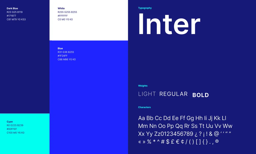
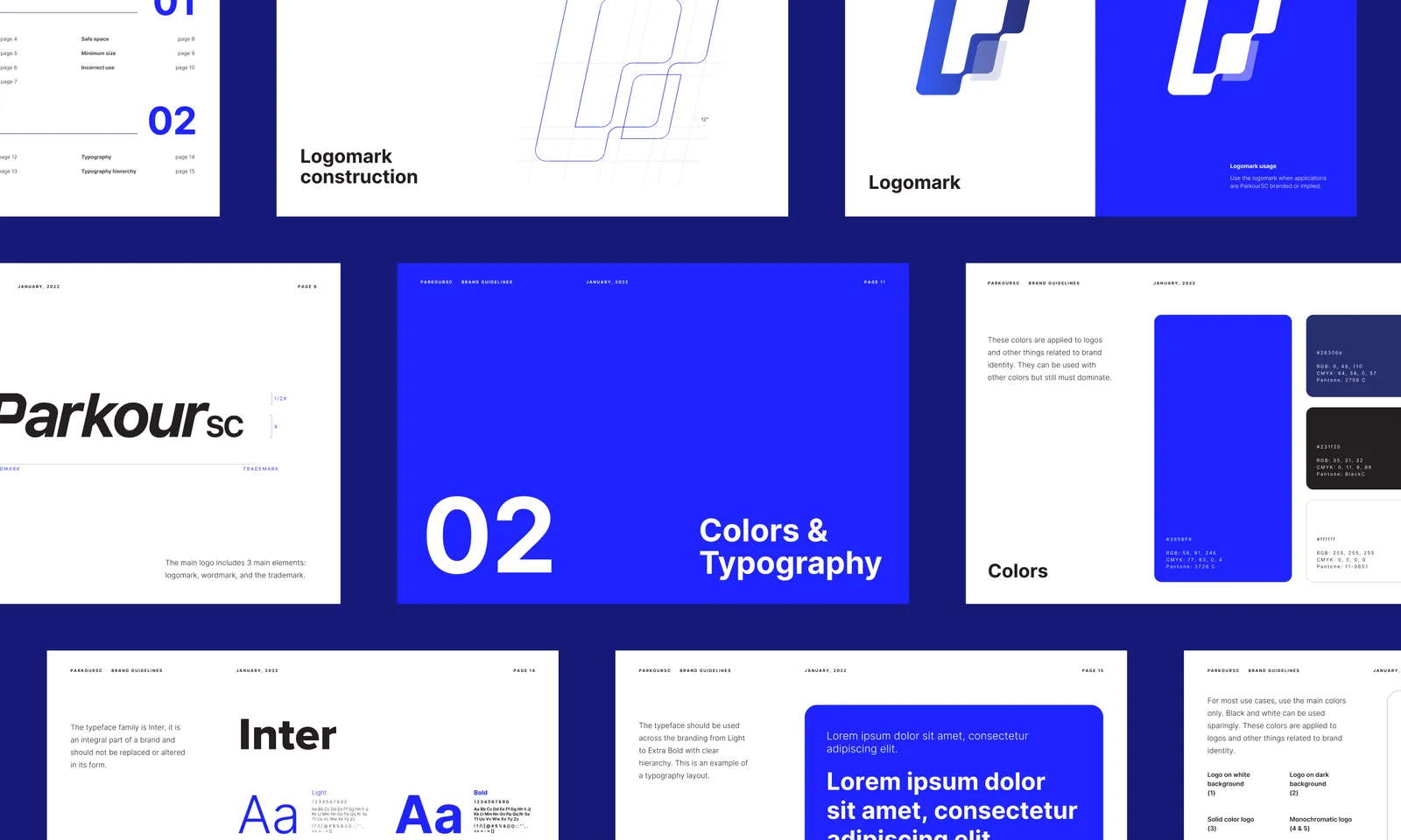
Every design element—from the color palette to the typography—was carefully selected to reflect ParkourSC’s values: agile, cutting-edge, and focused.
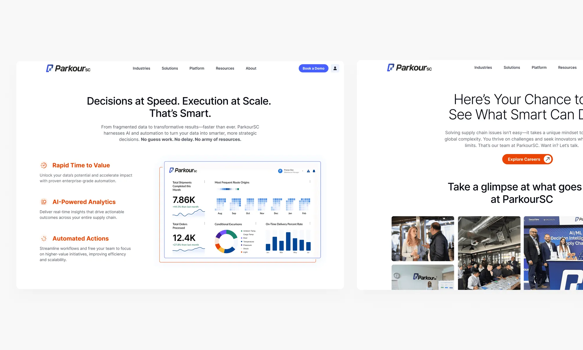
By October 2024, the redesign contributed to a 126% revenue increase from FY 2022 to FY 2024, gaining traction with clients like Thermo Fisher and Novartis, and supporting ParkourSC’s growth in supply chain solutions.