Sorae
beauty, made simple
Industry
Beauty
My Role
Art Director
Deliverables
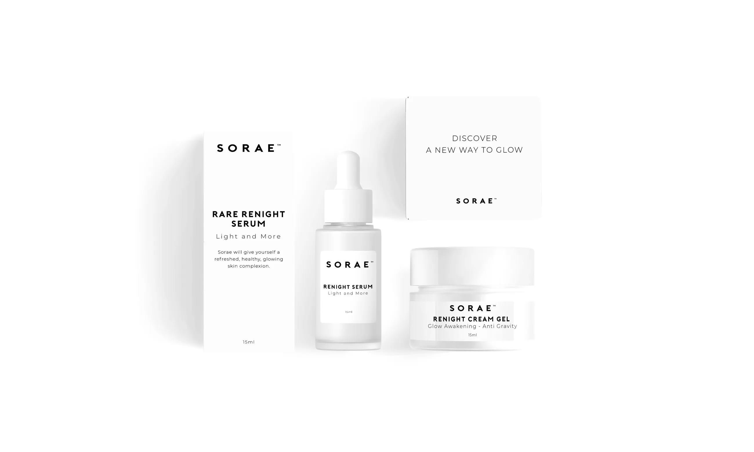
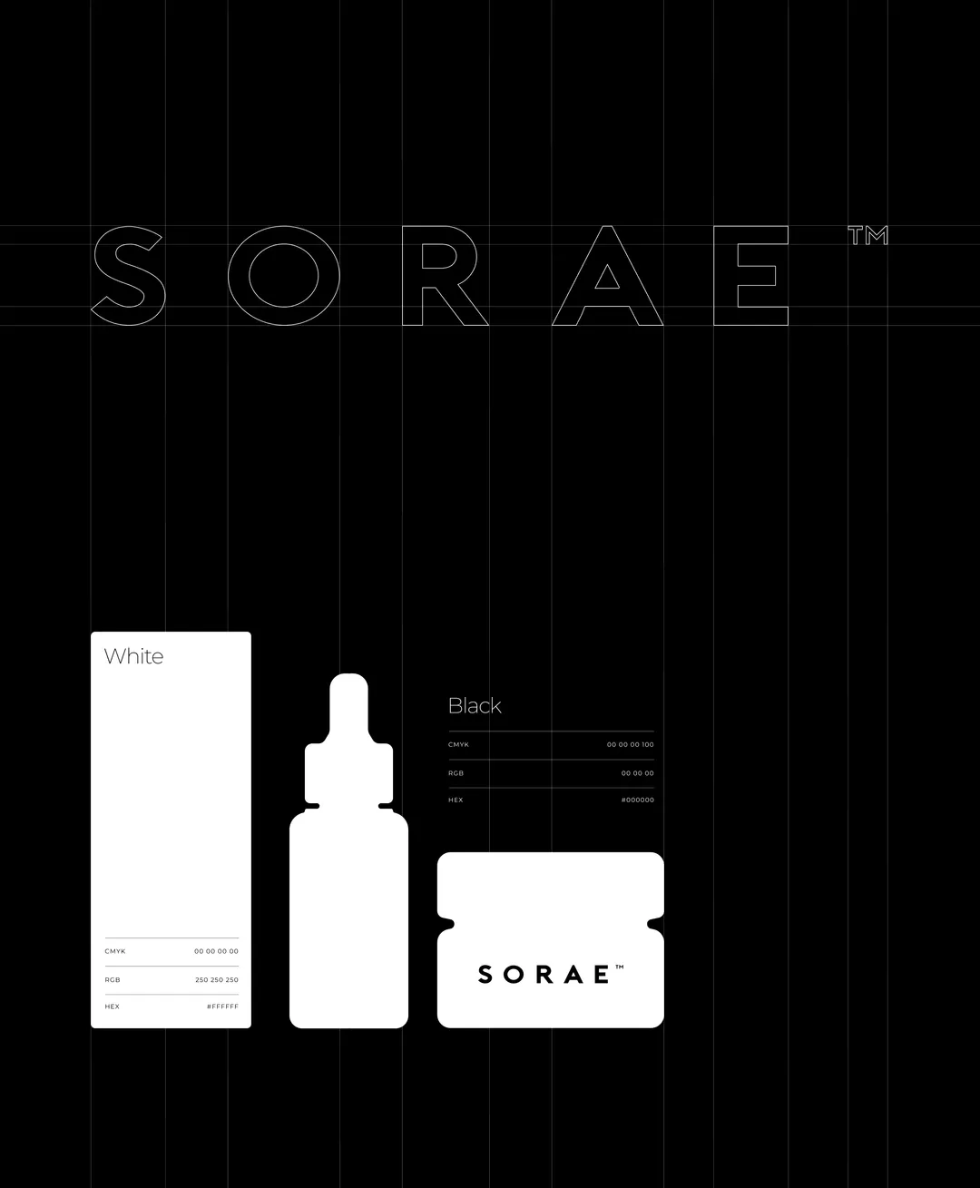
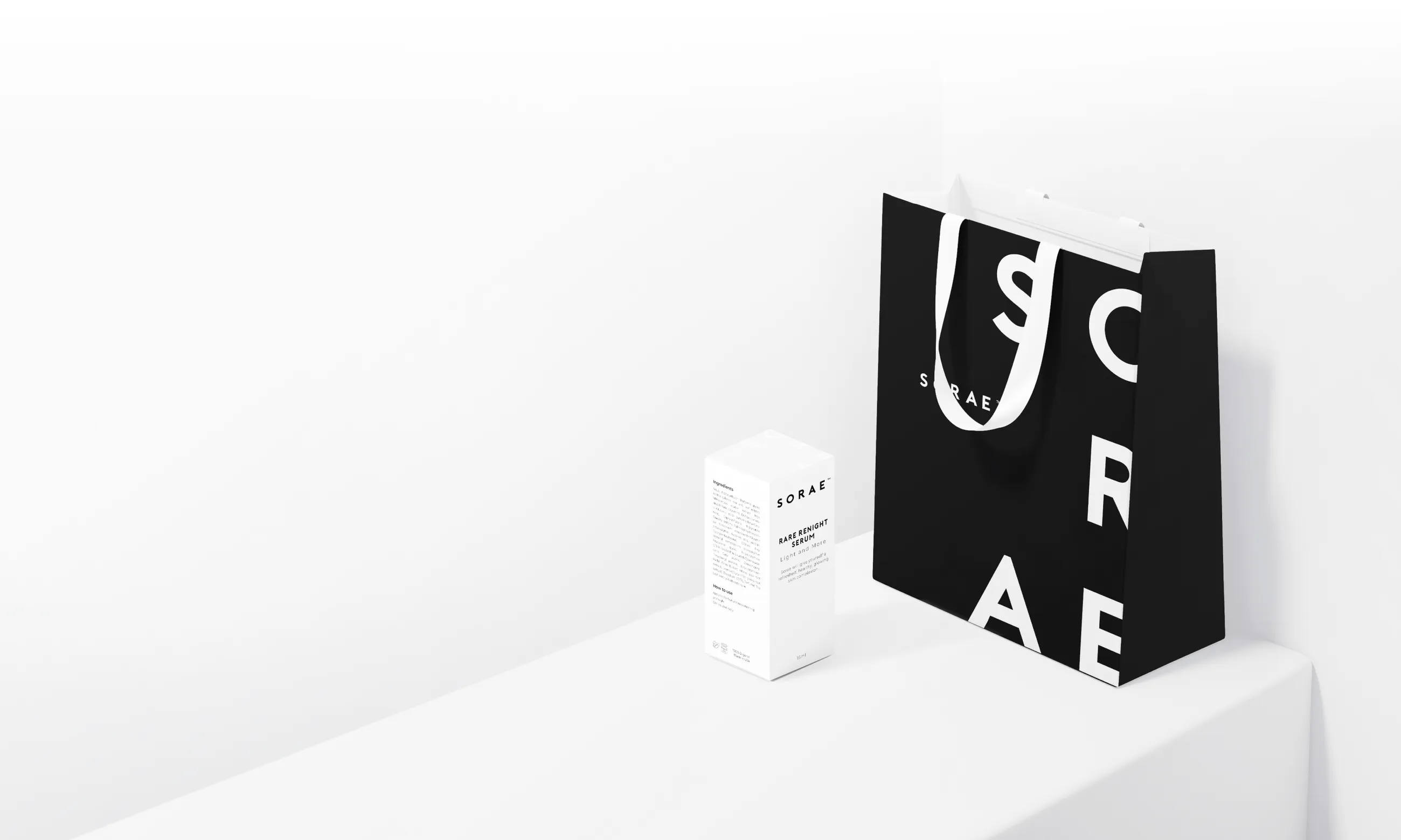
- Brand Identity
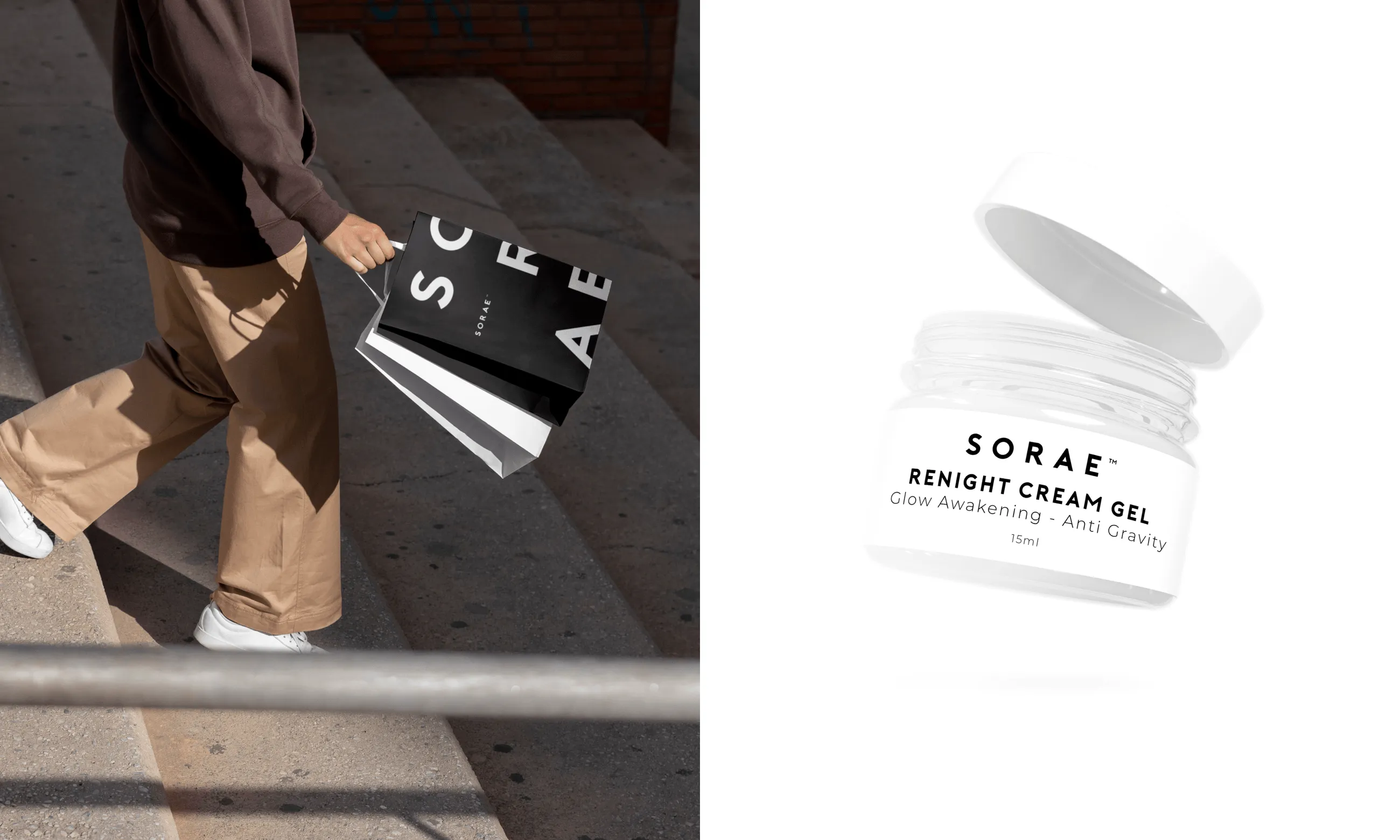
- Packaging
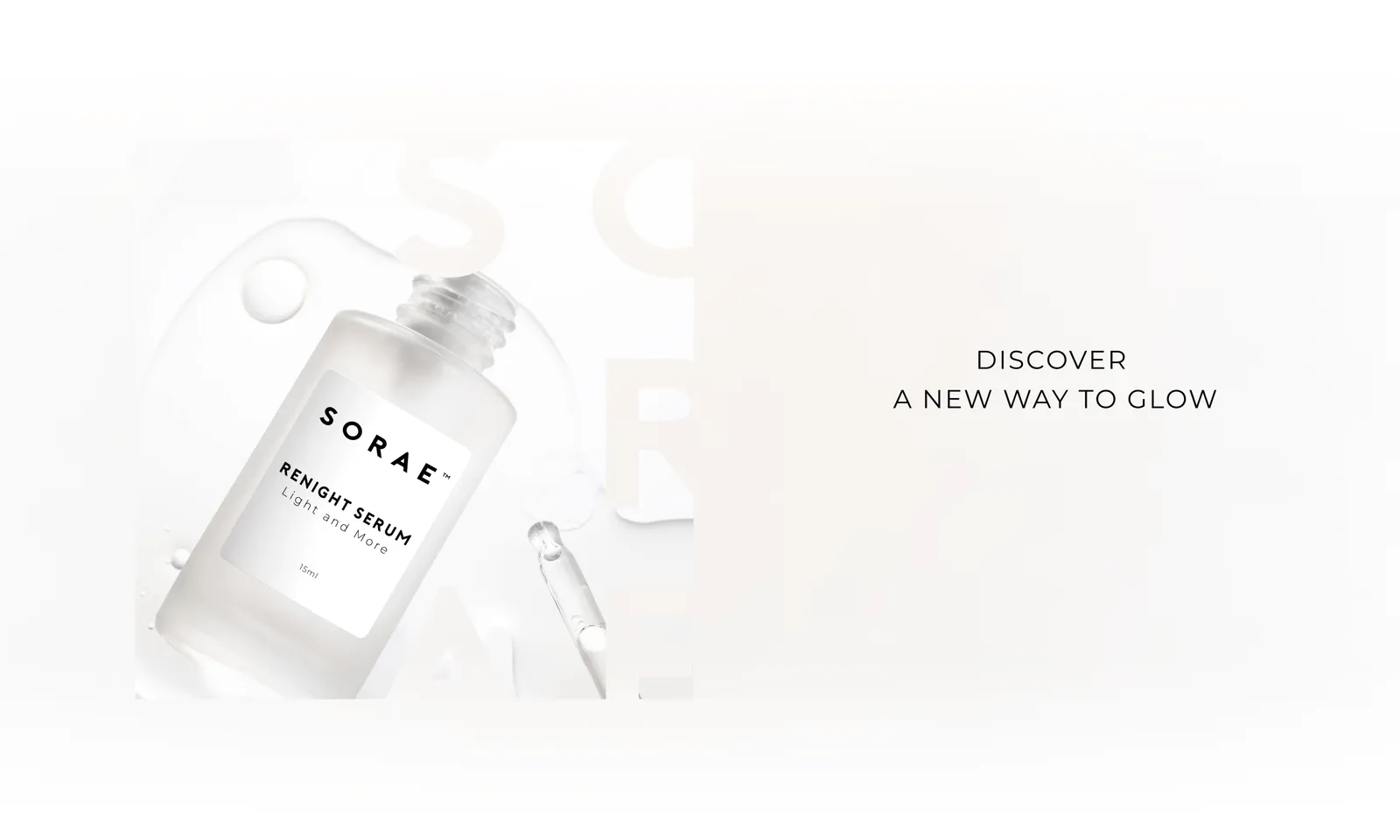
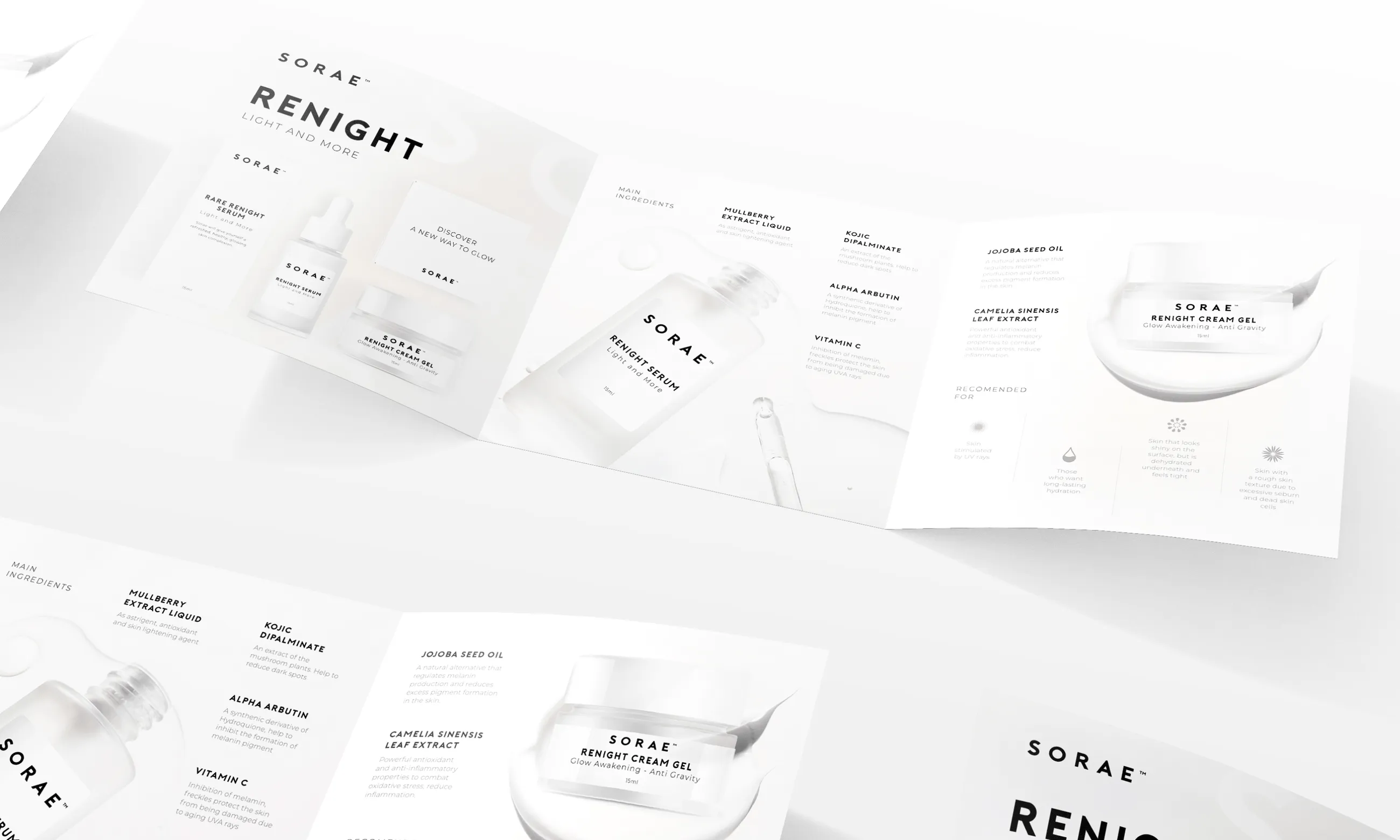
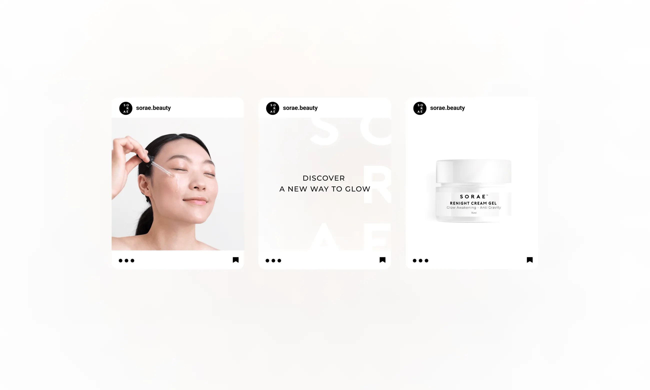
- Marketing Collateral
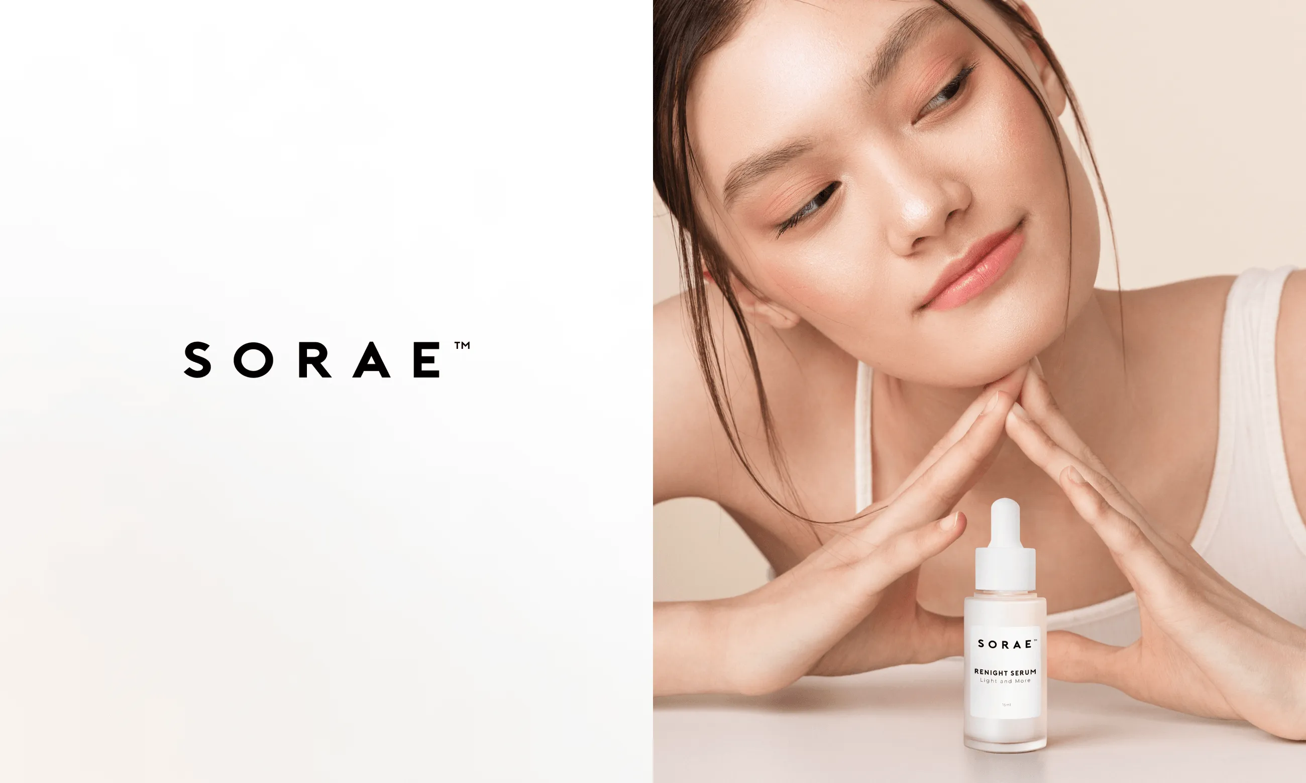
A beauty brand embracing simplicity.
Sorae launched a new product with a clear point of view: beauty doesn’t have to be complicated to work. This wasn’t about chasing trends. It was about staying true to a belief that fewer ingredients, fewer steps, and fewer distractions can lead to better results.
The visual system followed that same logic. A monochromatic palette, clean lines, and quiet details stretched across packaging, web, and marketing. The result is a design that feels as focused as the product itself—simple, but not spare. Calm, but not cold.
It resonated immediately. The new look sparked reactions like, “This feels different. This feels right.” Because it is. It’s not just a product—it’s a philosophy, expressed in form.
In its first month, the launch drove a 80% lift in local sales. Proof that simplicity connects when it’s backed by intention.